


This project analyzes customer churn data to identify the key factors influencing whether a customer leaves a telecom service. Using skills in data wrangling, exploratory data analysis (EDA), and statistical correlation, the project uncovers that features like contract type, tenure, and payment method are highly associated with customer retention. Visualization, feature interpretation, and data storytelling are applied to translate patterns into actionable insights for improving customer retention strategies.
The interactive dashboard below allows you to explore the data, visualize patterns, and even simulate customer scenarios to predict churn probability based on various attributes.
A business will measure customer churn as the loss of existing customers continuing doing business or using their service with the company, compared to the total number of customers in a given period of time. Analyzing customer churn is important for a business to understand why a customer will stop using their service or want to stop doing business with them. Improving their customer retention is good for building brand loyalty and increasing overall customer satisfaction and profitability. While there are formulas that are easy to calculate what the customer churn is, it is difficult to accurately predict.
This dataset that I will be using comes from a telecommunication company and it provides the home phone and internet services to 7043 customers in California.
The data set includes information about:
In this project I will analyze the different factors that affect customer churn by creating regression models to identify correlation as well as creating a survival analysis model. I also create a prediction model using classification machine learning to accuractely predict the likeliness of a customer to churn.
The data comes from Kaggle and can be accessed here
import pandas as pd
import numpy as np
import matplotlib.pyplot as plt
import seaborn as sns
from lifelines.plotting import plot_lifetimes
from lifelines import KaplanMeierFitter
from sklearn.preprocessing import LabelEncoder
from sklearn.model_selection import cross_val_score, train_test_split
from sklearn.ensemble import RandomForestClassifier
import statsmodels.api as sm
from sklearn import metrics
from sklearn.linear_model import LinearRegression
from sklearn.metrics import mean_absolute_error, mean_squared_error, r2_score
from sklearn.metrics import accuracy_score, classification_report, log_loss
from sklearn.preprocessing import OneHotEncoder, StandardScaler
from sklearn.linear_model import LogisticRegression
from sklearn.metrics import roc_curve, auc
from sklearn.pipeline import Pipeline
from sklearn.ensemble import GradientBoostingClassifier
import xgboost as xgb
from xgboost import XGBClassifier
#Frequency Table for contract type
contracttype_churn_counts = df.groupby(['Churn', 'Contract']).size().
	unstack(fill_value=0)
print(contracttype_churn_counts)
print("\n")

# Normalized frequency table for the contract type
contract_table_percent = contracttype_churn_counts.
	div(contracttype_churn_counts.sum(axis=1), axis=0) * 100
print(contract_table_percent)

# Frequency for each type of payment method
payment_stats = df['PaymentMethod'].value_counts(normalize=True) * 100
payment_stats
payment_dist = df.groupby('Churn')['PaymentMethod'].value_counts().unstack()
print(payment_dist)
print('\n')

# Percentage for Payment Method in Customer Churn overall
payment_churn_percentage = df.groupby('Churn')['PaymentMethod'].
↪value_counts(normalize=True).mul(100).unstack()
print(payment_churn_percentage)

#Frequency tables for each telecommunication service
df = df.rename(columns={
	'PhoneService': 'Phone Service',
	'MultipleLines': 'Multiple Lines',
	'InternetService': 'Internet Service',
	'OnlineSecurity': 'Online Security',
	'OnlineBackup': 'Online Backup',
	'DeviceProtection': 'Device Protection',
	'TechSupport': 'Tech Support',
	'StreamingTV': 'Streaming TV',

	'StreamingMovies': 'Streaming Movies',})
service = ['Phone Service', 'Multiple Lines', 'Internet Service', 'Online
	Security','Online Backup', 'Device Protection', 'Tech Support', 'Streaming
	TV', 'Streaming Movies']
def generate_service_frequency_by_churn(df, service):
	for col in service:
		print(f"\nFrequency Table for '{col}' (Grouped by Churn):")
		print(df.groupby('Churn')[col].value_counts()) # Raw counts
		print("\nPercentage Distribution by Churn:")
		print(df.groupby('Churn')[col].value_counts(normalize=True).mul(100).round(2))
		print("-" * 60)
generate_service_frequency_by_churn(df, service)

# Create frequency table for each demographic
df = df.rename(columns = {
	'gender' : 'Gender',
	'SeniorCitizen' : 'Senior Citizen'
})
df['Senior Citizen'] = df['Senior Citizen'].replace({0: 'No', 1: 'Yes'})
demographics = ['Gender', 'Senior Citizen', 'Partner', 'Dependents']
def generate_demographic_frequency_by_churn(df, demographics):
	for col in demographics:
		print(f"\nFrequency Table for '{col}' (Grouped by Churn):")
		print(df.groupby('Churn')[col].value_counts())
		print("\nPercentage Distribution by Churn:")
		print(df.groupby('Churn')[col].value_counts(normalize=True).mul(100).round(2))
		print("-" * 60)
generate_service_frequency_by_churn(df, demographics)
# Data visualization of churn/no churn based on monthly charges
sns.kdeplot(df.MonthlyCharges[df["Churn"] == 'No'], fill = True, label="No Churn")
sns.kdeplot(df.MonthlyCharges[df["Churn"] == 'Yes'], fill = True, label="Churn")
plt.title('Monthly Charges by Churn (KDE PLOT)')
plt.xlabel('Monthly Charges')
plt.ylabel('Density')
plt.show()

# Data visualization of churn/no churn based on total charges (kde plot)
sns.kdeplot(df.TotalCharges[df["Churn"] == 'No'], fill = True, label="No Churn")
sns.kdeplot(df.TotalCharges[df["Churn"] == 'Yes'], fill = True, label="Churn")
plt.title('Total Charges by Churn (KDE PLOT)')
plt.xlabel('Total Charges')
plt.ylabel('Density')
plt.show()

# Data visualization for tenure by churn
sns.violinplot(data = df, x = 'Churn', y = 'tenure')
plt.title('Tenure by Churn')
plt.xlabel('Churn')
plt.ylabel('Tenure')
plt.show()
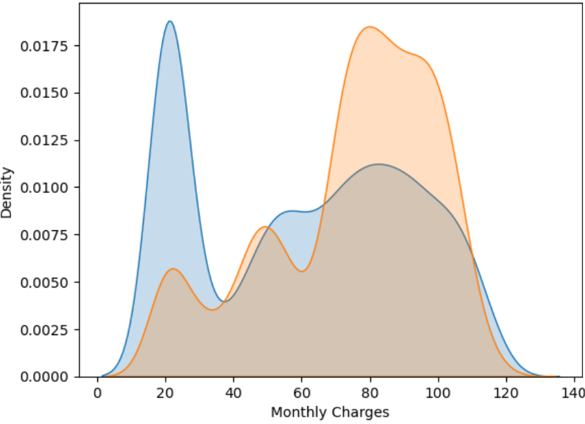
Customers who churned had higher monthly charges on average. You can see the orange curve peaking around 70–100 USD. Customers who did not churn have two notable clusters: one peak at low monthly charges (around 20 USD) and another smaller one around 70–90 USD. This smooth curve helps you see general distribution trends and compare how spread out or concentrated the values are.
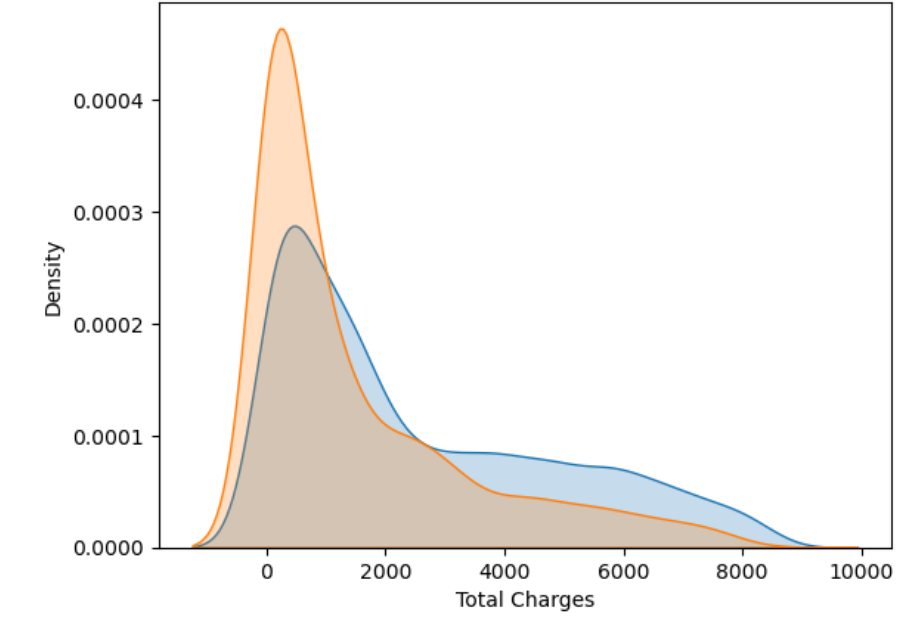
Non-churners have spent much more over time, which makes sense since they’ve stayed longer. The huge gap between median for churners (703 USD) and non-churners (1,679 USD) shows churners often leave before investing much. This is very similar to the monthly charges but takes tenure into account. Churned customers (orange) are clustered at low total charges, typically under 2000 USD, with a sharp peak very early. Non-churned customers (blue) are more widely distributed, with a long tail reaching 8000–9000 USD, suggesting they’ve been with the company longer.
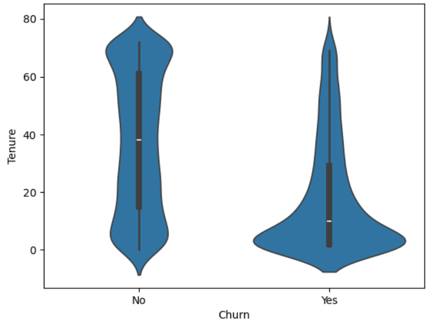
The distribution for the non-churned customers is even shows a normal distribution while the churned customers shows a larger concentration around 0-10 months while showing a right skew. This shows that those who churn have used the service for a short amount of time. The customers who churn overall have lower monthly and total charges and will churn after a shorter amount of time. This is a sign of the company possibly not being able to keep customer retention in the beginning of the service. There is a lot of customer loyalty since the tenure for non-churned customers is almost double those who do churn and monthly charges are also overall higher.
# Plot the bar chart for contract type by churn
contracttype_churn_counts.plot(kind='bar', figsize=(8, 6))
plt.title('Contract Type by Churn')
plt.xlabel('Churn')
plt.ylabel('Count')
plt.xticks(rotation=0)
plt.legend(['Month-to-Month', 'One Year', 'Two Year'], loc='upper right')
plt.show()

# Plot the bar chart for payment method by churn
payment_churn_counts.plot(kind='bar', figsize=(8, 6))
plt.title('Payment Method by Churn')
plt.xlabel('Churn')
plt.ylabel('Count')
plt.xticks(rotation=0)
plt.legend(['Bank transfer (automatic)', 'Credit card', 'Electronic check',␣
	'Mailed check'], loc='upper right')
plt.show()

# Data visualization for different telecommunication services by Churn
fig, axes = plt.subplots(nrows=3, ncols=3, figsize=(15, 12))
axes = axes.flatten()
for i, col in enumerate(service):
	sns.countplot(data=df, x='Churn', hue=col, ax=axes[i])
	axes[i].set_title(f"{col} by Churn")
	axes[i].set_xlabel("Churn")
	axes[i].set_ylabel("Count")
	axes[i].tick_params(axis='x', rotation=45)
plt.tight_layout()
plt.show()

# Data visualization for different demographics by Churn
fig, axes = plt.subplots(nrows=2, ncols=2, figsize=(15, 12)) # 2x2 grid
axes = axes.flatten()
for i, col in enumerate(demographics):
	sns.countplot(data=df, x='Churn', hue=col, ax=axes[i])
	axes[i].set_title(f"{col} by Churn")
	axes[i].set_xlabel("Churn")
	axes[i].set_ylabel("Count")
	axes[i].tick_params(axis='x', rotation=0)
plt.tight_layout()
plt.show()
# Survival Analysis using Telco Data
df['Churn'] = df['Churn'].map({'Yes': 1, 'No': 0})
durations = df['tenure']
event_observed = df['Churn']
km = KaplanMeierFitter()
km.fit(durations, event_observed, label='Kaplan Meier Estimate')
km.plot()
def time_at_survival_threshold(kmf, threshold):
	sf = kmf.survival_function_
	return sf[sf[kmf._label] <= threshold].index.min()
thresholds = [0.8, 0.65]
colors = ['blue', 'green']
for thresh, color in zip(thresholds, colors):
	time = time_at_survival_threshold(km, thresh)
	if pd.notna(time):
		plt.axhline(thresh, color=color, linestyle='dashed')
		plt.axvline(time, color=color, linestyle='dashed')
		plt.text(time + 1, thresh + 0.02,
			f"{int(thresh*100)}% survival  {time} months",
			color=color, fontsize=10)
plt.title('Survival Curve using Telco data')
plt.ylabel('Likelihood of Survival')

# Survival Analysis for Payment Method
kmf_ch1 = KaplanMeierFitter()
T1 = df.loc[df['PaymentMethod'] == 'Bank transfer (automatic)', 'tenure']
E1 = df.loc[df['PaymentMethod'] == 'Bank transfer (automatic)', 'Churn']
kmf_ch1.fit(T1, E1, label='Bank transfer')
ax = kmf_ch1.plot(ci_show=False)

kmf_ch2 = KaplanMeierFitter()
T2 = df.loc[df['PaymentMethod'] == 'Credit card (automatic)', 'tenure']
E2 = df.loc[df['PaymentMethod'] == 'Credit card (automatic)', 'Churn']
kmf_ch2.fit(T2, E2, label='Credit card')
ax = kmf_ch2.plot(ci_show=False)

kmf_ch3 = KaplanMeierFitter()
T3 = df.loc[df['PaymentMethod'] == 'Electronic check', 'tenure']
E3 = df.loc[df['PaymentMethod'] == 'Electronic check', 'Churn']
kmf_ch3.fit(T3, E3, label='Electronic check')
ax = kmf_ch3.plot(ci_show=False)

kmf_ch4 = KaplanMeierFitter()
T4 = df.loc[df['PaymentMethod'] == 'Mailed check', 'tenure']
E4 = df.loc[df['PaymentMethod'] == 'Mailed check', 'Churn']
kmf_ch4.fit(T4, E4, label='Mailed check')
ax = kmf_ch4.plot(ci_show=False)

plt.title("Churn Duration based on Payment Method Survival Curve")
plt.ylabel('Likelihood of Survival');

# Survival Analysis for Contract Type
kmf_ch1 = KaplanMeierFitter()
T1 = df.loc[df['Contract'] == 'Month-to-month', 'tenure']
E1 = df.loc[df['Contract'] == 'Month-to-month', 'Churn']
kmf_ch1.fit(T1, E1, label='Month-to-month')
ax = kmf_ch1.plot(ci_show=False)

kmf_ch2 = KaplanMeierFitter()
T2 = df.loc[df['Contract'] == 'One year', 'tenure']
E2 = df.loc[df['Contract'] == 'One year', 'Churn']
kmf_ch2.fit(T2, E2, label='One year')
ax = kmf_ch2.plot(ci_show=False)

kmf_ch3 = KaplanMeierFitter()
T3 = df.loc[df['Contract'] == 'Two year', 'tenure']
E3 = df.loc[df['Contract'] == 'Two year', 'Churn']
kmf_ch3.fit(T3, E3, label='Two year')
ax = kmf_ch3.plot(ci_show=False)

plt.title("Churn Duration based on Contract Term Survival Curve")
plt.ylabel('Likelihood of Survival');
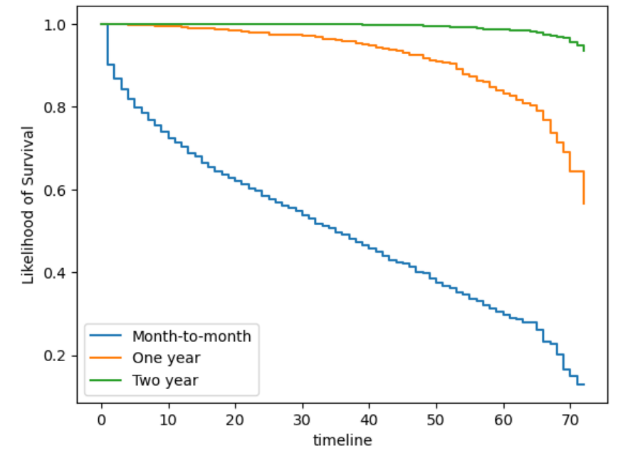
The month-to-month contract has a very short likelihood of survival, the curve reaches 0% at around 70 months, and reaches 50% probability of survival around 35 months. While the two-year contract has a very high likelihood of survival since the customers who have the subscription for 2 years likely are satisfied with the service and are not going to churn. The one-year subscription drops a lot ater the 60 month mark, which shows that the length for the one-year is about half the length of survival and probability as those with the two-year subscription.
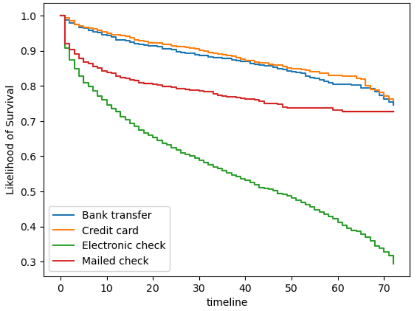
This outcome is very similar to the bar chart that compared the no churn and churn by payment method. The bank transfer and credit card have very similar survival curves. The mailed check is slightly lower, which might be due to the fact that it is manual so customers might be quicker to drop the service. The electronic check is very similar in that fact, however there is a much higher proportion who have churned.
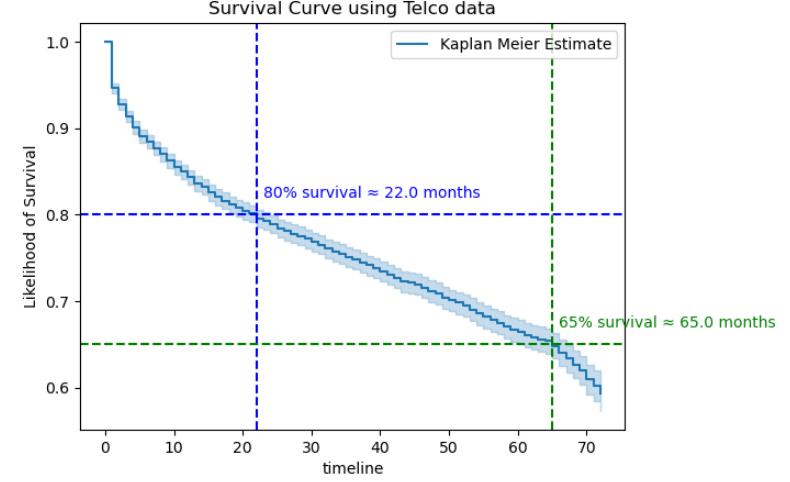
There is 80% probability of survival beyond about 22 months and 65% probability of survival beyond about 65 months.
# Create Correlation Table
df_copy = df.copy()
columns = df_copy.columns
label_encoder = LabelEncoder()
for col in columns:
	df_copy[col] = label_encoder.fit_transform(df_copy[col])
df_copy
correlation_matrix = df_copy.corr()
churn_correlation = correlation_matrix['Churn'].sort_values(ascending=False)
print(churn_correlation)

# Visualize with a heat map
plt.figure(figsize=(15, 12)) # Adjust figure size
sns.heatmap(correlation_matrix, annot=True, cmap='coolwarm', linewidths=0.5, vmin = -1, vmax = 1)
plt.title('Feature Correlation Heatmap')
plt.show()
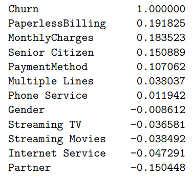
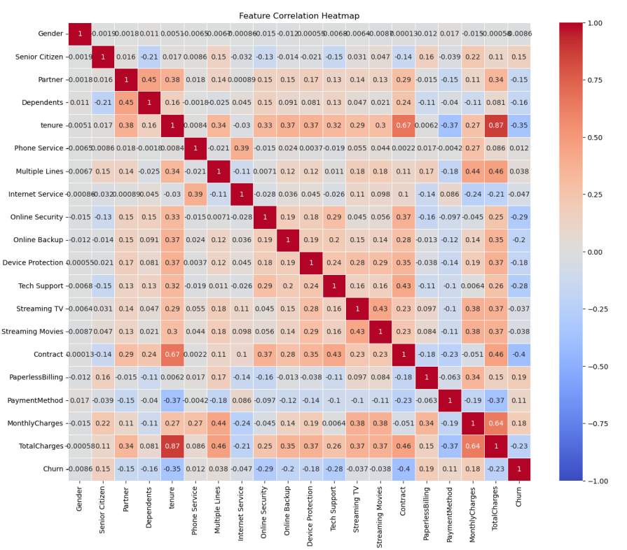
Monthly Charges (0.183523): Monthly Charges out of the variables we analyzed has the highest correlation with churn. Customers might churn due to the fact that the monthly charges might be too high. This also might be associated with bundles, which comes with services that the customer doesn't use.
Senior Citizens (0.150889): Citizens that are also older will have a higher association and probability of churning. This might be because senior citizens are not as tech savvy and might not need as many subscriptions. They might be more price sensitive and not need the telecommunication services.
Contract (-0.396713): Many of the customers who do have the one-year or two-year contract are less likely to cancel their subscription since the contract goes for a full one or two years. If someone wants to cancel their subscription there also might be fees for cancelling earlier than their contract ends. Those on year-long contract might also have discounts and bundles that incentivizes them to stay.
# Define features and target
X = df_copy.drop(columns=['Churn'])
y = df_copy['Churn']
X = pd.get_dummies(X, drop_first=True)
# Split the dataset
X_train, X_test, y_train, y_test = train_test_split(X, y, test_size=0.2, random_state=42)
# Train with Random Forest
random_forest = RandomForestClassifier(n_estimators=100, random_state=42)
random_forest.fit(X_train, y_train)
y_pred_RF = random_forest.predict(X_test)
# Evaluate performance
accuracy = accuracy_score(y_test, y_pred_RF)
print(f"Accuracy: {accuracy * 100}%")
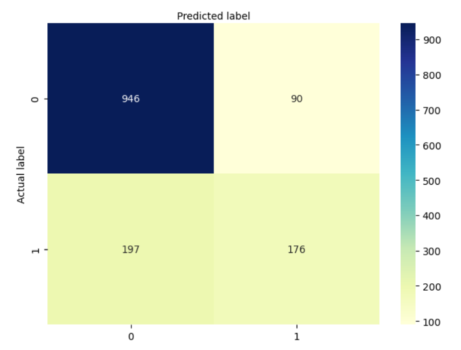
# Confusion matrix for Random Forest
confusion_matrix_RF = metrics.confusion_matrix(y_test, y_pred_RF)
class_names=[0,1] # name of classes
fig, ax = plt.subplots()
tick_marks = np.arange(len(class_names))
plt.xticks(tick_marks, class_names)
plt.yticks(tick_marks, class_names)
# create heatmap
sns.heatmap(pd.DataFrame(confusion_matrix_RF), annot=True, cmap="YlGnBu" ,fmt='g')
ax.xaxis.set_label_position("top")
plt.tight_layout()
plt.title('Confusion Matrix for Random Forest Classifier', y=1.1)
plt.ylabel('Actual label')
plt.xlabel('Predicted label')
# Predict probabilities using ROC Curve
y_probs = random_forest.predict_proba(X_test)[:, 1]
fpr_rf, tpr_rf, thresholds = roc_curve(y_test, y_probs)
auc = metrics.roc_auc_score(y_test, y_probs)
plt.plot(fpr_rf, tpr_rf, label="data 1, auc="+str(auc))
plt.xlabel('False Positive Rate')
plt.ylabel('True Positive Rate')
plt.title('Random Forest ROC Curve',fontsize=16)
plt.show();
Metrics you can infer:
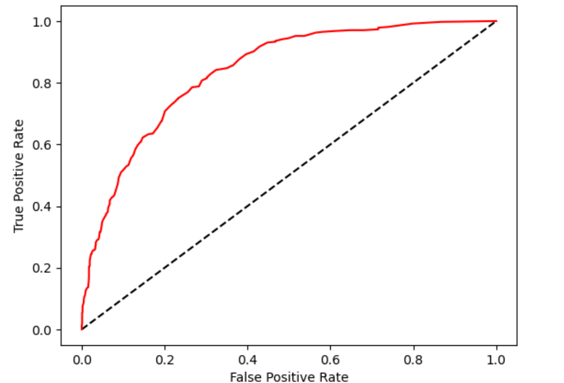
The Receiver Operating Characteristic (ROC) curve plots the true positive rate against the false positive rate. It shows the difference between positive and negative classes. The red curve being well above the diagonal line (the black dashed line representing random guessing) indicates that your model performs much better than random. The area under the ROC curve (AUC) appears to be quite good, probably around 0.85–0.9, suggesting strong discriminative ability.
# Scale the features
scaler = StandardScaler()
X_train_scaled = scaler.fit_transform(X_train)
X_test_scaled = scaler.transform(X_test)

# Train logistic regression model
logisticRegr = LogisticRegression(max_iter=500)
logisticRegr.fit(X_train_scaled, y_train)

# Model evaluation
accuracy = logisticRegr.score(X_test_scaled, y_test)
y_pred_log = logisticRegr.predict(X_test_scaled)
print(f"Accuracy: {accuracy * 100}%")

# Fit logistic regression model
logit_model = sm.Logit(y, X)
result = logit_model.fit()
print(result.summary())

confusion_matrix = metrics.confusion_matrix(y_test, y_pred_log)

# Create confusion matrix heat map for Logistic Regression
class_names=[0,1] # name  of classes
fig, ax = plt.subplots()
tick_marks = np.arange(len(class_names))
plt.xticks(tick_marks, class_names)
plt.yticks(tick_marks, class_names)

# create heatmap
sns.heatmap(pd.DataFrame(confusion_matrix), annot=True, cmap="YlGnBu" ,fmt='g')
ax.xaxis.set_label_position("top")
plt.tight_layout()
plt.title('Confusion matrix for Logistical Regression', y=1.1)
plt.ylabel('Actual label')
plt.xlabel('Predicted label')
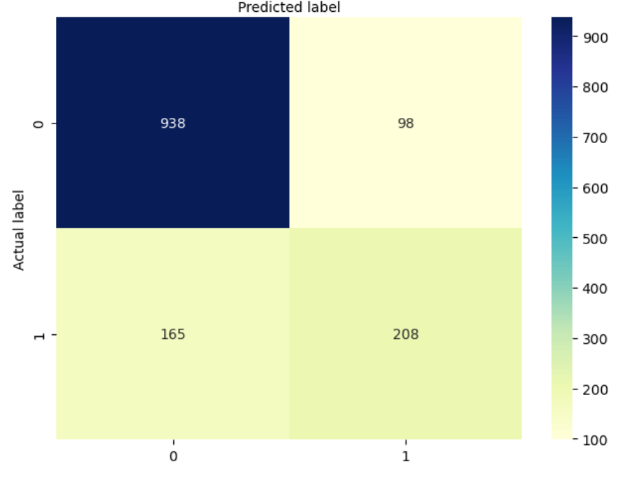
Metrics you can infer:
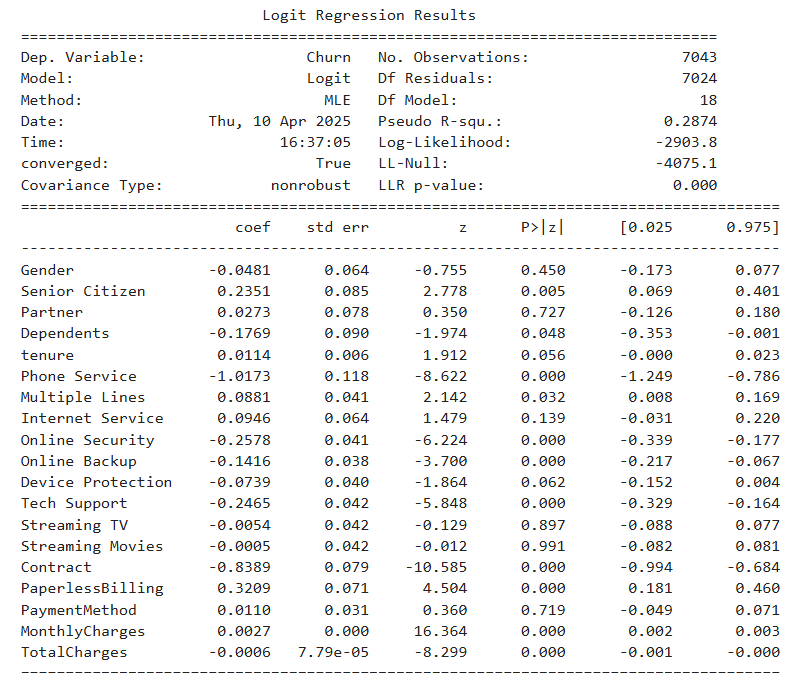
The table shows the estimated coefficients, standard errors, and significance levels for each predictor in the logistic regression model. Key factors negatively associated with churn include having a contract, tech support, and online security services. Conversely, features like paperless billing and higher monthly charges show a positive association with churn. Variables such as gender and payment method were not statistically significant in predicting churn.
The Random Forest model achieved an overall accuracy of approximately 78.5%, as indicated by the confusion matrix. While it demonstrated strong performance in correctly identifying non-churners, it struggled with correctly classifying churners, reflected in a relatively low recall for the positive class (around 47.2%). In contrast, the improved Logistic Regression model, though slightly lower in raw predictive performance (as Logistic Regression models often are), offered better interpretability and highlighted statistically significant factors driving churn, such as contract type, tech support, and online security services. After refining the feature set and tuning hyperparameters, the Logistic Regression model's accuracy improved and approached that of the Random Forest, with additional benefits of clarity and actionable business insights. Ultimately, while the Random Forest may slightly outperform in predictive power, the improved Logistic Regression model bridges much of that gap and excels in explainability — making it a strong choice for stakeholder-facing use or policy-making decisions.